EDUCATION
Knowt Website Redesign Challenge
Tools: Figma, Adobe Illustrator
Challenge
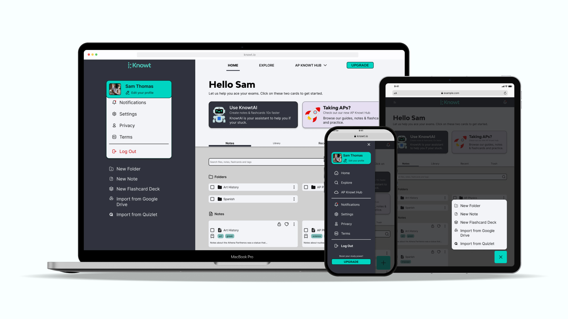
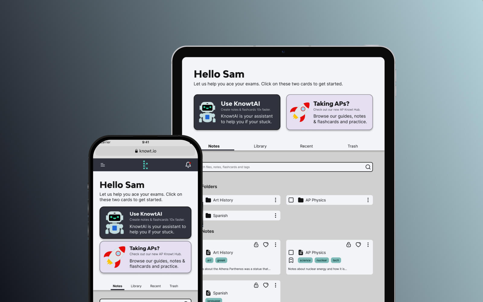
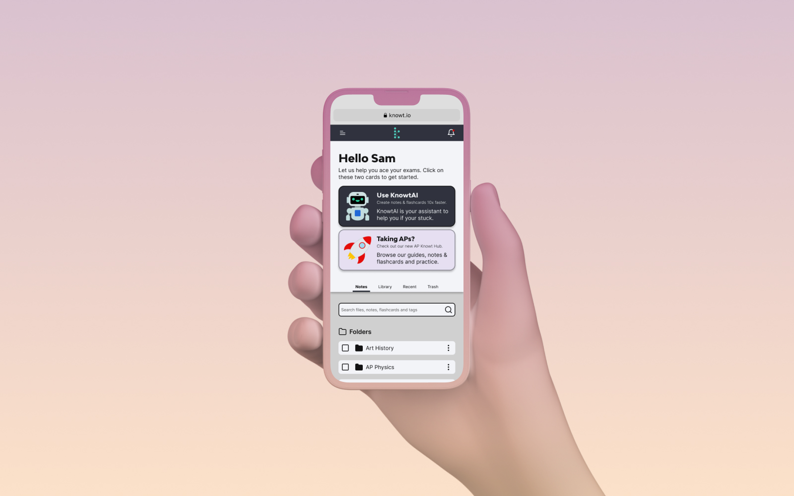
Knowt is an app that helps students study through Quizlet-style flashcards. My challenge was to look at the current website and see how I could address any issues with readability, usability and accessibility by improving the app’s visual design.
Role
I was responsible for improving the usability of the website through visual design. This meant keeping in mind the company’s brand guidelines while also showing how the app could be improved with simple, actionable changes.
Impact
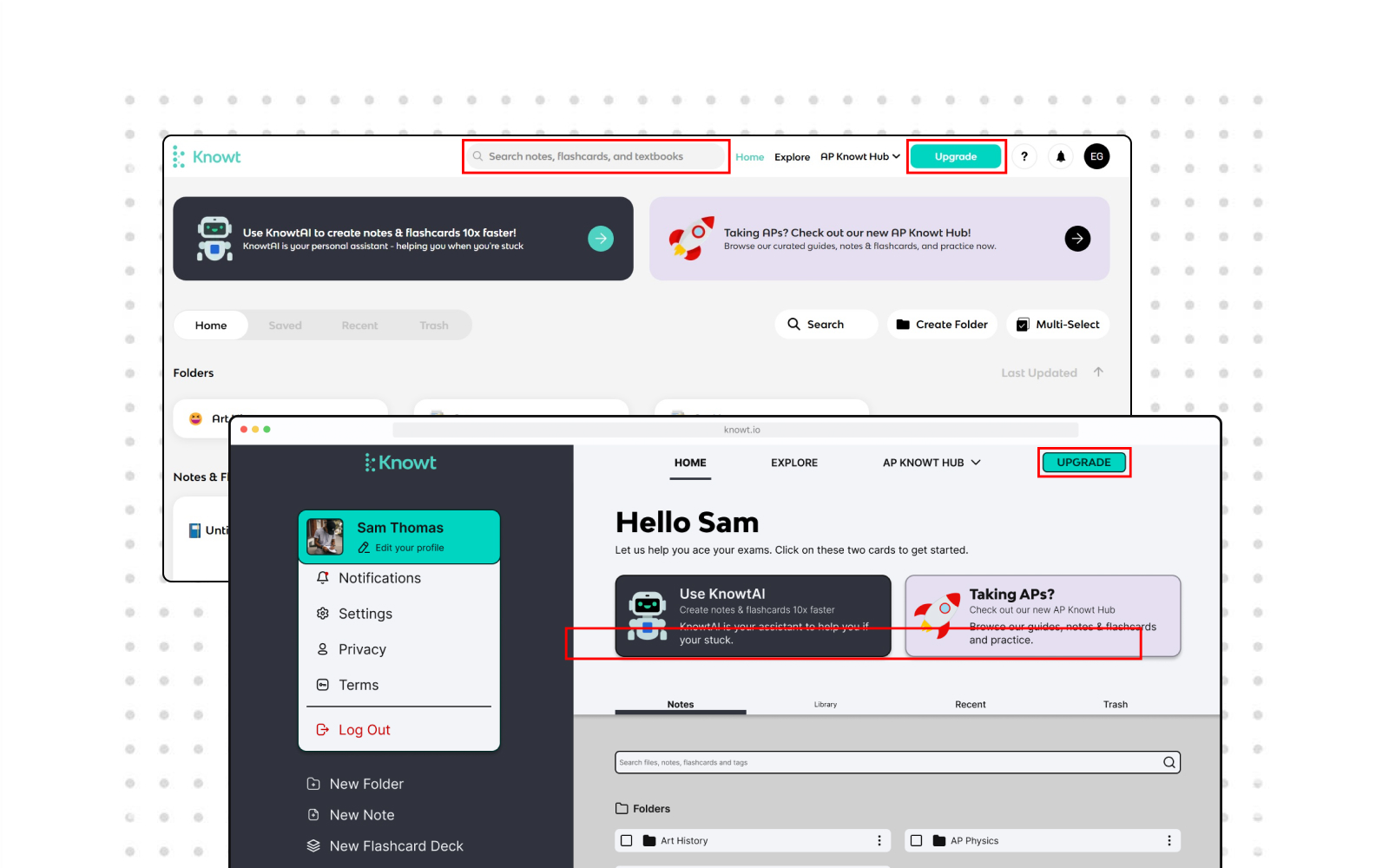
01 Uniformity in the Design
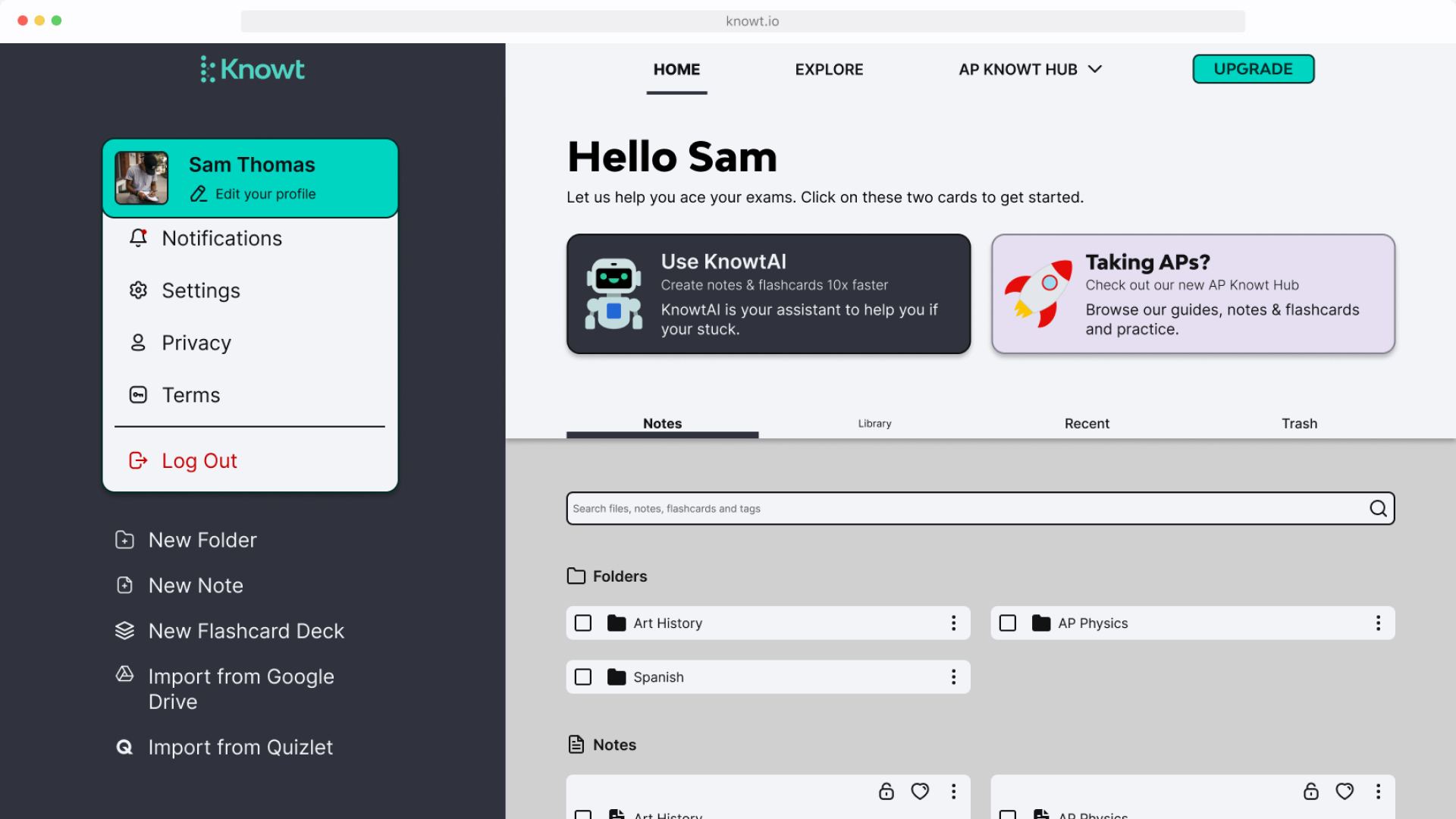
The original website had elements such as buttons, search bars and icons changing drastically between pages. My design highlighted a need for uniformity in the design so that users would know what to expect as they use the app.
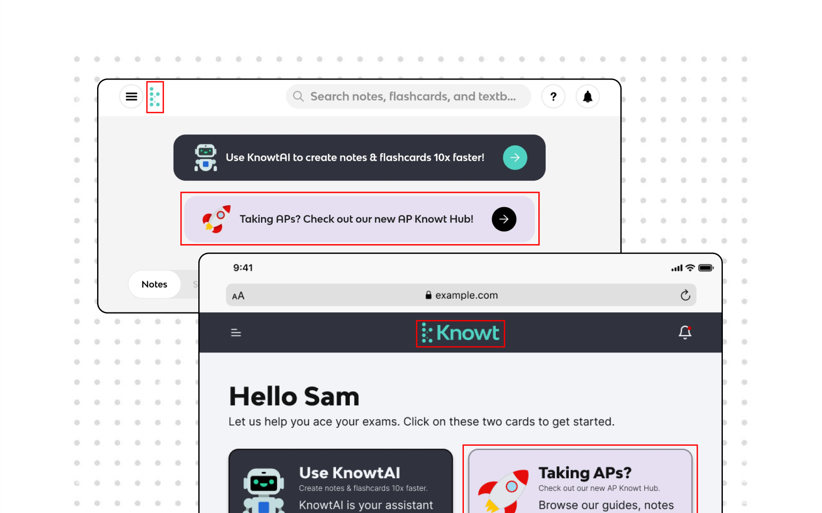
02 Improved Contrast
Improving contrast between elements on the page allowed users to see things more easily. That meant that they would be able to find what they wanted and decrease the chances of them missing important information because it faded into the background.
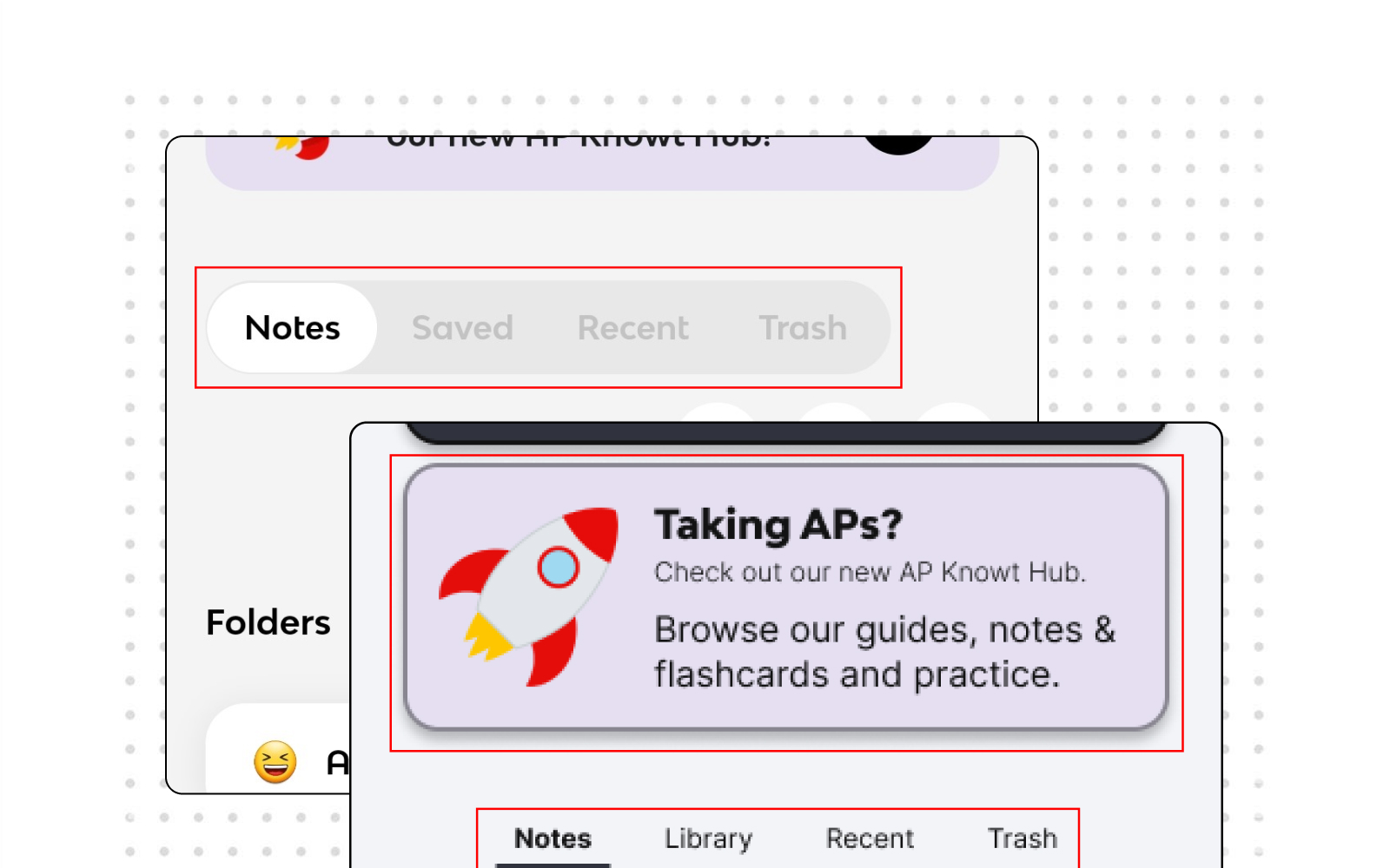
03 Improving the Wording
Rewording buttons and other sections of text so that they more accurately expressed what actions they would be doing or expecting the user to do. This would help to limit frustration from someone clicking on something and expecting something different.
Final Solutions
